EFU Insurance - Building a Scalable Consumer Platform
EFU is one of Pakistan’s longest-standing insurance groups, with decades of market presence and a nationwide footprint across Life insurance. The organisation serves hundreds of thousands of individuals and corporate clients and processes large volumes of policies, documentation, and claims every year. In EFU Life’s health segment alone, the company reports 487,656 individuals covered, 545 corporate clients, and 165,976 claims paid in 2024, with PKR 4.23B paid out in claims. At this scale, insurance is not just a product. It is a system of trust, regulatory accountability, and operational reliability.
Role
UX Researcher
UI Designer
Year
2025
Client / Company
EFU Insurance
Problem Overview
EFU’s onboarding was built for an agent led world. Customers typically had to coordinate a visit, share documents in person, and rely on the agent to translate complex questions, handle exceptions, and push the case through compliance and underwriting. Over the years, the internal agent experience evolved into a deeply branched tool with hundreds of fields, calculators, engines, regulatory checks, and operational handoffs. It worked for trained experts, but it also created a structural limitation: scaling onboarding meant scaling physical effort. More customers required more visits, more follow ups, more manual entry, and more time spent on repetition instead of advisory work. The real risk was drop off, mistrust, and errors. When sensitive questions arrive too early or without context, customers hesitate. When the process feels endless, people delay. When information gets re entered or repeated, accuracy suffers.
Solution
Rather than redesigning the agent flow screen by screen, I approached this as a platform problem. The goal was to translate EFU’s operational and compliance logic into an end user experience that feels understandable, paced, and trustworthy. I defined a single reusable consumer onboarding model that could support Life, Motor, Home, and Travel insurance, while allowing product specific questions to plug in where needed. The new experience focused on progressive disclosure, value before commitment, and plain language guidance. Customers are guided through light eligibility and estimation first, then introduced to deeper questions, verification, and payment only once intent and trust are established.
My Role
I led the end to end design of the customer assisted insurance experience across discovery, experience strategy, interaction design, and validation. I audited and mapped the existing agent journey, defined the shared onboarding framework for multiple insurance products, translated complex underwriting and compliance requirements into customer friendly flows, designed wireframes and high fidelity UI in Figma, and planned usability testing to validate comprehension and confidence. Throughout delivery, I partnered closely with product, engineering, underwriting, compliance, and agent teams to ensure the solution balanced customer needs, agent workflows, and business constraints.
Impact

The goal was to make EFU’s insurance onboarding accessible to end users by turning a complex, agent-led process into a paced, trustworthy digital journey where customers can understand their options and submit confidently without feeling overwhelmed.
I started by answering one question: where is effort being wasted, trust being strained, or value being delayed. Instead of jumping into UI, I mapped the existing journey as a current state experience, because the agent flow already contained years of operational decisions, compliance rules, and underwriting logic. The problem was not that those rules existed. The problem was how they were exposed and when. To map the journey clearly, I structured it as stages and layers. Horizontally, I grouped the flow into seven major stages that reflect how people move through insurance, not how the system stores data. Within each stage, I documented what the system asks, what the customer experiences, what the agent compensates for, and where friction accumulates. This method made the invisible work visible, especially where agents were acting as translators and emotional buffers.


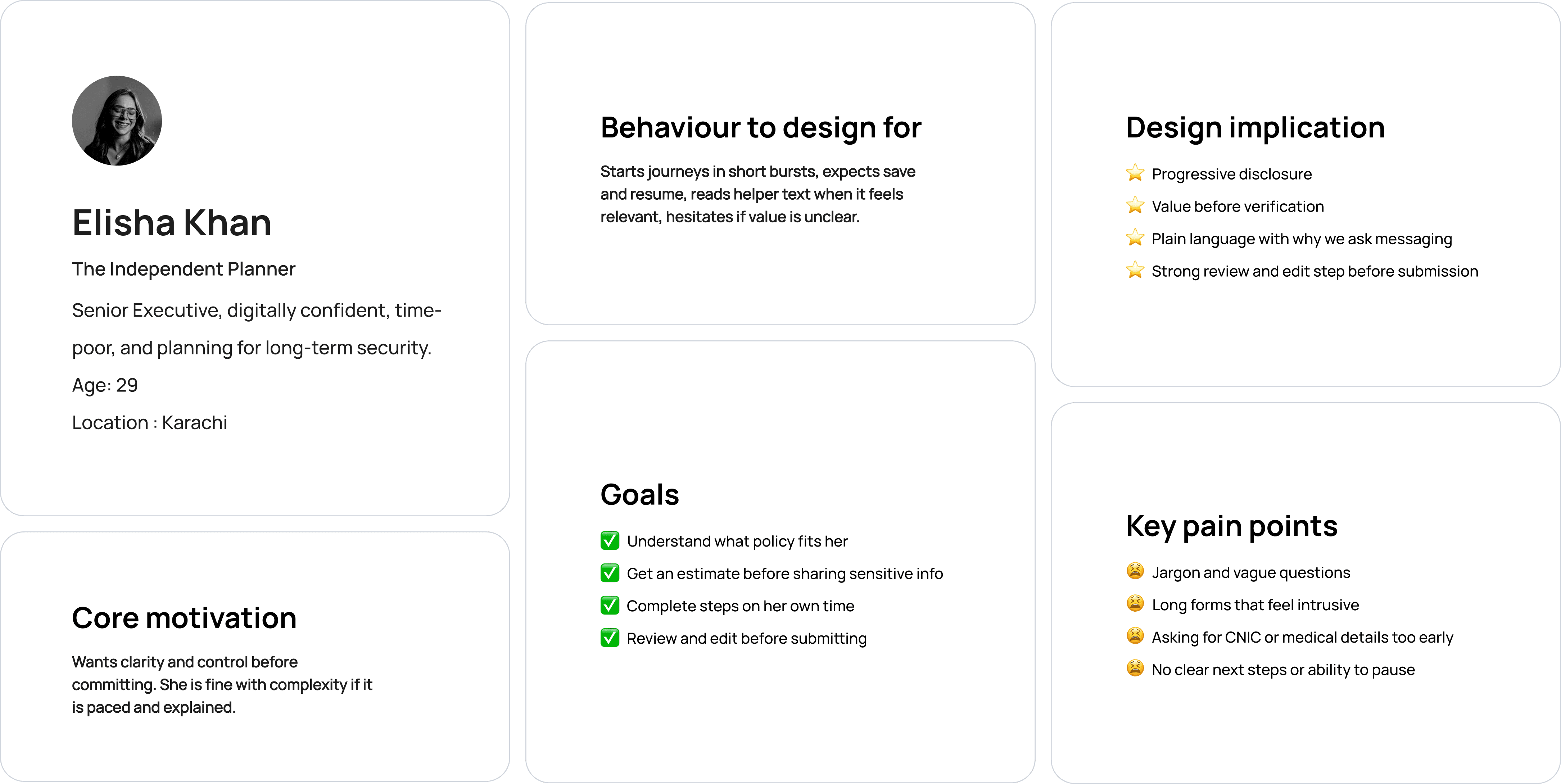
Elisha represents a growing segment of EFU’s customers: digitally capable, time-constrained, and trust-aware. Designing for her meant creating an experience that scales without assuming expertise, patience, or physical presence.
Insurance complexity is inevitable, but exposing all of it at once is not. Many fields are required by underwriting and compliance, but not at the same moment. The experience should reveal depth progressively, surfacing questions only when they are meaningful and necessary within the journey.

The conversational entry lowered anxiety and made the start of the process feel lighter than a traditional form. Users stayed engaged longer in the early steps because the experience felt guided, human, and easy to follow. It also improved comprehension for simple questions because users could focus on one input at a time without being distracted by surrounding fields.
As soon as the flow reached regulated disclosures, medical questions, and financial commitments, the chat format started to break down. Users wanted to scan information, compare what they had entered, and confirm details before moving forward. In a chat stream, that kind of review became tedious and error-prone. Compliance stakeholders also raised concerns because critical acknowledgements and consent need to be clearly visible, reviewable, and easy to audit, which is harder to guarantee in a purely conversational layout.
The chat prototype was strong for early momentum, but it didn’t provide enough structure for high-stakes, regulated steps. Insurance onboarding requires clear review points, explicit confirmations, and the ability to see the “whole picture” before submission. A structured flow supported those needs better while still allowing the journey to feel paced and guided.
Even though the final solution used a structured interface, the chat exploration shaped the tone and pacing of the product. I carried forward the “one question at a time” rhythm where possible, simplified microcopy to feel more human, and introduced structured review moments that gave users the same reassurance agents provide in person.


Instead of redesigning the agent flow, I restructured it into a customer-assisted model built around clear phases. This framework was designed once and reused across Life, Motor, Home, and Travel, with product-specific questions plugging in where required.

From the framework, I designed the end to end screens in a way that reduces cognitive load, avoids jargon, and builds trust progressively. Questions were rewritten into plain language, grouped by what the user understands naturally, and sequenced so sensitive requests appear only after value is shown. Wherever possible, the UI supports confidence with small explanations, preview states, and clear progress. A key part of the solution was creating strong reviewability. Because insurance requires accuracy, and because the journey is long, the user needs an explicit point where they can see everything they provided, edit sections without restarting, and submit with confidence. This mirrors the agent led “final check” moment that happens in person.

Users were significantly more willing to proceed with CNIC and identity verification after seeing estimates and plan clarity.
Clear grouping, structured sequencing, and a dedicated review checkpoint reduced time spent locating missing details and requesting clarifications.
By shifting repetitive data capture to a structured customer assisted flow, agents spent less time collecting and re-entering information and more time guiding customers at decision points.