BLOC Admin - Digital Real Estate Investment Platform
In Pakistan, property ownership is financially out of reach for many, and DAO PropTech set out to make it accessible through fractional real estate investment. As the company scaled and introduced more projects, the business required a reliable foundation to manage how properties were launched, monitored, and communicated to investors. Fractional investment depends on trust, investors must see clear, transparent, and accurate project information at every stage. For DAO PropTech, this meant having an internal system capable of handling sales performance, funding rounds, construction progress, and project documentation in a structured, consistent way. To support this growing operational complexity, I designed a Property Management module for BLOC Admin that would strengthen the company’s core processes, streamline project management, and create the transparency essential to DAO PropTech’s business model.
Role
UX Researcher
UX Designer
UI Designer
Year
2022
Client / Company
DAO PropTech
Problem
DAO PropTech had no unified workspace to manage a project’s lifecycle. Each team tracked information separately, which led to delays, inconsistent numbers, and duplicated work. Key issues: 1. Construction delays surfaced too late. 2. No clear visibility into sales vs remaining area. 3. Milestones tracked inconsistently across teams. 4. Documents scattered and versioned incorrectly. 5. Multiple spreadsheets causing errors and confusion. The company was scaling. The operational system behind it was not.
Solution
I designed a Property Management module that brings all project information into one organised system. It replaces spreadsheets and fragmented tools with a structured, transparent workspace for Sales, Construction, Finance, and Management. Core solutions: 1. Real time project overview. 2. Unified sales and area tracking. 3. Rounds linked to construction milestones. 4. Visual construction timeline. 5. Centralised, version controlled documents. 6. Consistent onboarding for every new project. The module reduces manual effort, improves accuracy, and gives every team complete visibility from acquisition to construction.
Impact

I started with a Lean UX Canvas to align everyone on what we were solving and how success would be measured before touching the UI.
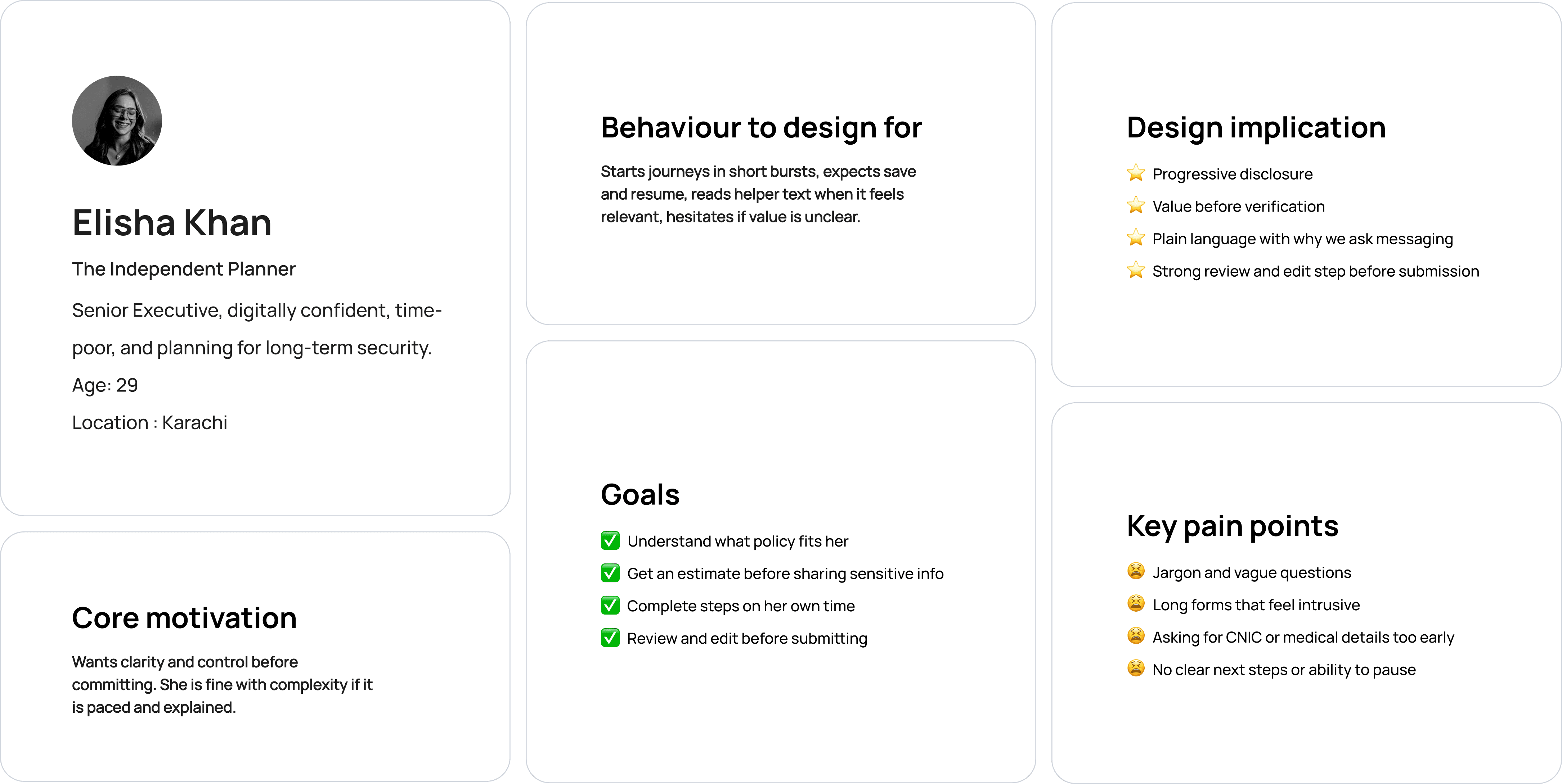
I built proto‑personas early to give shape to our assumptions about users and to keep stakeholder needs at the center of design. These lightweight personas made it easy to communicate user pain points and priorities to the team without heavy documentation.
I conducted stakeholder interviews and observed how Sales, Construction, Finance, and Management handled projects day to day. The patterns were consistent across teams: 1. Data fragmentation: each team kept separate spreadsheets. 2. Document chaos: files existed in multiple versions across drives. 3. Communication gaps: WhatsApp updates made progress hard to track. 4. Operational overhead: onboarding required recreating folders, trackers, and templates from scratch. The research revealed that the issue wasn’t lack of data, it was lack of structure.
Once I understood the roles and pain points, I mapped the existing workflows for Sales, Construction, Finance, and Management. These current state workflow maps showed how people really worked, where they switched tools, and where information was lost or duplicated. They helped reveal: 1. Dependencies that were invisible (for example, rounds depending on milestones that only lived in chat). 2. Manual checks and workarounds that absorbed a lot of time. 3. Points where different teams looked at different numbers and thought they were correct. These maps were not future flows. They were a snapshot of reality and became my starting point for design.
From interviews, workflows, and observations, I translated insights into concrete product requirements that would directly shape the final UI.

I explored layouts through quick, low fidelity sketches to understand structure and relationships between data heavy sections. Instead of creating full grey box wireframes, I chose to move directly into high fidelity prototypes. The reason was simple: with multiple departments involved and complex, dense data models, abstract wireframes were too vague. High fidelity screens, even in the first round, made the data presentation tangible and allowed stakeholders to react to something that looked much closer to their real day to day work. This choice helped: 1. Align teams faster 2. Uncover edge cases earlier 3. Surface usability issues specific to data density and hierarchy
Leadership needed one place to see project health without piecing together spreadsheets and messages. I designed a clean overview showing round status, area sold vs remaining, construction progress, and upcoming milestones. Clear hierarchy and compact status cards make the entire project scannable at a glance.

Sales, Construction, and Finance relied on conflicting spreadsheets and chat updates. I unified their workflows by linking rounds and construction milestones in one view. Pricing, area status, and milestone progress now appear together, with clear indicators and automatic updates that give every team real time visibility without manual checks.

Version conflicts were a major risk. I designed a structured Documents hub grouped by category with version control, and a Finance workspace where payments, contracts, and documents are connected to rounds and milestones. The UI is intentionally minimal to support confidence and clarity.

The new module significantly reduced duplication, manual updates, and version conflicts across teams. What was previously scattered across spreadsheets, chats, and folders became a single, organised flow. Sales, Construction, and Finance could finally work in sync, with clearer responsibilities, faster reviews, and far fewer errors in day to day operations.


